As librarians, we are always trying to make sure that our libraries and resources are accessible and usable by all patrons. While we often focus on visible disabilities - are the aisles wide enough for a wheelchair? Do we have audio and large print titles for those who have visual issues? While these are wonderful things to consider, I wanted to take 5 minutes to talk about a less obvious disability that people live with every day.
Did you know that about 10% of the population has dyslexia?
What Is It?
First of all, let's define "dyslexia." In general terms, dyslexia is a learning difference that presents in a cluster of symptoms, any or all of which may be present. These include:- Mental rotation of letters or difficulty differentiating similar letters such as b, d, p, and q
- Phonological awareness and phonological decoding, or which letters make which sounds
- Slower processing speed of written (and sometimes auditory) material
- Letters seeming to "jump around" on the page
- Spacing of letters being inconsistent, so words crowd together or drift apart on the page
The Mayo Clinic explains that effects of having this disorder can include:
- Trouble learning - since reading is a skill on which many other subjects are based, a child with dyslexia may fall behind their peers.
- Social problems - trouble learning and keeping up with peers may lead to low self-esteem, behavioral issues, anxiety, and aggression.
- Problems as Adults - If untreated, these problems can compound over time, and leave a person unable to reach their full potential.
Ready for an example? Take a look at this website, which was designed to simulate what it's like to try to read with dyslexia. (Some people say it is a very accurate depiction; others disagree. Not every person experiences this the same way.)
What Helps?
Okay! We know what it is. Now, how can the library help?Accessible Signage
Let's start with the easiest thing we can do. ALA has some great ideas on how to make your library more accessible for people with dyslexia (these tips are written for the children's room specifically, but they can be helpful for everybody). One of the things they suggest is to make sure that you use pictograms when possible (for example, an image of a toilet on the restroom sign). Use clear, easy-to-read shelf signs and aisle markers.If you have room, try to place books facing outward when on display (reading spine labels sideways can be very difficult!). When making fliers, try to left-justify your text and not leave hyphenated words straddling two lines. You can also make sure that you write things using an easily-readable font.
Fonts
The font you use can make a big difference in making something accessible to someone with dyslexia.
According to the University of Michigan, "good fonts for people with dyslexia are Helvetica, Courier, Arial, [and] Verdana." They also comment that, "Arial Italic should be avoided since it decreases readability."
 Did you know that there's a special font that makes things easier to read? It's called Open Dyslexic, and it is specially designed to make things easier for people to process. The bottom of the letters is a bit thicker than the tops, making it easier to differentiate each letter from others that are similar. As the website states, the font "was intended to address: contrast/blindness, letter confusion or rotation, and crowding."
So, are we supposed to own every book in a dyslexic-accessible font? If only we had that kind of funding! But it's okay, because we have some exciting news for you:


That's right! If you can get it as an e-book, you can read it in Open Dyslexic font! OverDrive has this available, and therefore so do Libby and Sora. If you are using Hoopla, they have this listed under "fonts" as "Dyslexic Support."
All you have to do is open your book, click on the font options, and you can switch! This will remain as your default any time you read with this platform. (It is also worth a mention that some studies have shown that using a black font on a "not quite white background" makes it easier to read, as well. Luckily, you can adjust background color, too.)
While purchasing every title in an accessible font is cost prohibitive, please note that this font is free to download, and can easily be used on fliers.
As a side note, some books - particularly for children - already come in a dyslexic-friendly font. Notably, the Here's Hank series by Henry Winkler is published with this font, which is particularly helpful because the main character (and the author, too!) has dyslexia.
Reading Guides
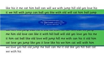
No, not book lists (though those could be useful, too). I'm talking about colored page overlays, also known as "reading rulers" or "highlight strips." These are transparent, colored pieces of plastic that a reader can place over a page. The change in color helps the words to stay grounded on the page, and the horizontal line helps to keep the reader on the correct sentence.I found some on Amazon that come in a variety of sizes, to help people of all ages who might need it. They are inexpensive and can help a great deal.


No comments:
Post a Comment