Pages

Friday, January 30, 2015

10 Meaningful Library Volunteer Roles

Library volunteers - we all get the requests, but what to do with them? There is just only so much dusting, weeding, children programming prep, and mending you can have them do. Below are some ideas that have been successful at other libraries, especially for teens and adults. Please keep in mind - some union contracts may not allow certain tasks to be performed by volunteers, so before you do anything, make sure you double check with your Director what you can and cannot have a volunteer do.

Window Artists

  If your volunteers are artistic, get them to work on your windows! All they need are brushes, tempera paint, and a dab of dish soap (just to make it easier to wash off afterwards). You could have them paint advertisements of upcoming events or you can do seasonal themes. Better yet – pick out a children’s picture book and ask them to paint an inspiration from it, then you can put the book on display.

Children's Room windows at the Marlborough Public Library. Teens painted their inspirations from The Very Hungry Caterpillar by Eric Carle 

Outreach Specialists

  Is there any library that does this enough? Find outgoing people who are willing to promote library services and resources at community events and festivals. They can even bring library card registration forms or a floating book collection, which we discussed a few months back.

Program Facilitators

   Tap into your volunteer’s passion. What kind of programs could they run at the library and you provide the advertising? Pikes Peak Library District has a manga artist run their anime meetings as well as teachers to run their ESL circles and teach foreign languages.  Don’t be afraid to think outside of the box! Alachua County Library District has local history aides staffed by volunteers.

Shelf Managers

   By far, this is the favorite position our teens enjoy at our library. We train them to be shelf readers and they spend half their time making sure their section is in order and the other half of the time shifting books. If you have any pages, see if you can match your shelf mangers to a page and have the page supervise their work. (If people are unable to pass the shelf reading test, have them only focus on shifting books. There's always plenty of work to be done there.)

Library Photographers

   Train a few photographers to come in and take pictures of your big events or final products. We include a photo release with our online registration so we can easily know ahead of time who we can photograph, but we also give the photographers permission forms to hand out if needed. Make sure they download their favorite pictures on your computer BEFORE they leave, or you may never get them. This program has been very beneficial for our social media networks and our website -- and all of our library photographers are teen volunteers. Note: Make sure you credit them for their work! They like to see their name attached to their pictures. Also, consider investing in a DSLR camera. The picture quality greatly increases, even if you just use the auto mode.

Photo Credit: MPL Photographer, Lauren Munday

Social Media Managers

   Social media can easily eat up a lot of anyone’s time, especially if you're trying to post on Facebook twice a day. There’s no reason why a librarian needs to manage these accounts 24/7. Volunteers can help post new information that may interest patrons (if you don’t want to link them directly to your account, you can have them email you links) and there are 3rd party apps for Instagram like Iconosquare which will let you repost content, so your volunteers will only need to tag you and you can reshare. Create a content guideline and find ways to divide up the work!

Collection Assistants

     Use volunteers to help you fine-tune your collection. Print out reports of missing books so they can double check they are not on the shelves and then you can delete them. Have them look up your series (fiction, manga, and graphic novels) and make a list of missing books for you to order. If you put stickers on your books (like Teen’s Top Ten), have them hunt them out and add them.

Technology Gurus

     Some libraries let volunteers work one-on-one with patrons. Other libraries tap into their skills to help keep up with their own computers like installing updates and reimaging laptops so all the junk is cleared off of them and they won't slow down. You know, the things that you know you should be doing, but never have time to do...

Library Marketers

    The more you market your programs, the more the community will know about them. A volunteer can easily post all of your events online like Patch.com, your local newspapers, and most especially the local TV station. They could deliver fliers around the city/town. They can hand stacks of the library newsletters to local grocery stores and hair salons. They could write up press releases and news articles about programs past which you can send to the local newspapers. They could even help create ads for your website and social media, if you like their artistic style (Remember Canva? It can do wonders, if you have the time!).

Find Your Passion and Turn It Into a Volunteer Opportunity

     South Brunswick Public Library has a puppeteer program where they teach teens how to do a show and then the teens perform for children at the library. Marlborough Public Library had a 4D Movie presentation of Frozen where teens engaged all of the five senses during the movie. Louisville Public Library has a Reading Buddies program that connect struggling young readers with teens to practice reading each semester. None of these are quick volunteer opportunities, but they give volunteers a chance to learn a new skill, be very creative, and provide a program to local patrons. It could be very rewarding!

Summer Bonus

Is your library buzzing with patrons unable to find their school's required summer reading books? Consider doing what Shrewsbury Public Library did and create teen greeters. They sit at table near the door with school book lists in hand. They are trained to find the books on the shelves and, if they are all checked out, they can help patrons request the book from another library. Summer chaos avoided!

Friday, January 23, 2015

Catch Patrons' Attention with These 7 Easy Flyer Tips

This week I am excited to announce that we have a guest blogger, Dan Barbour from Shrewsbury Public Library. He is a YA Librarian who has excelled in flyer design that has sold out events. Today, he is going to share a few tricks that he's learned along the way.

I've worked in libraries over half my life, and while I've seen many different aspects of library programming surge forward into new and exciting territories, one important element that is often left in the Stone Age is event marketing. I've been designing library program ads since before I could drive a car, and I've learned a few basic tips which I'm going to share. Do with these pointers what you wish, but I can assure you, programs don't always sell themselves, and a few tricks can be the difference between a room of empty seats and a successful program. There are many programs you can use to make a sign, but I highly recommend investing in Adobe Illustrator - the flexibility is so much better. (Jess Note: but if you cannot afford Adobe Illustrator or are intimidated by its learning curve, check out our post about Canva) Here we go…

1. Less (Text) is More

* The rule of seven lines for text is a good guideline to shoot for, but many times you need more, so try using boxes/blocks to break up text. Some programs require a full presenter bio and/or sponsorship information that you cannot edit or leave off…make this as small as possible not to discourage readers. If it looks like it’s going to take too long to read a sign, most people won’t read it at all.

* If there is information that isn't crucial to your sign, in all cases leave it off the sign!

* Consider adding a QR code and/or website link for additional text that you in turn can leave off the sign. Interested readers will then have the option to learn more. The site www.qrstuff.com is a great free and simple resource for creating QR codes. Even if people don’t use the QR code, it makes your sign look more modern and “with it”!

2. Don't Go Font Crazy

* With the exception of company logos, keep your signs to no more than three different fonts. Also choose fonts that are simple to read, especially from a distance.

* Sites such as www.dafont.com allow you to download free fonts that look better than the standard set that could make your sign look less professional.

3. Use Size and Space to Your Advantage

* Use the space you have - don’t be afraid to make your text as big as will fit the area you are working with.

* Play around with the alignments (center, right, left, justified) – in many cases center aligned looks the best.

* Some signs need TONS of information and you cannot get around it. To make this excess text look better, consider using an inverted text box like this:

4. Watch Your Colors

* Be careful with colors – using yellow text on white is one example of a bad idea (which I have seen used more than once!). Here is a guide to complementary colors – I find it a useful tool when thinking about what colors to pick when designing an event ad - http://www.tigercolor.com/color-lab/color-theory/color-harmonies.htm

5. Convey Your Message Through Font Size

* Focus on the point/message when choosing which text to enlarge and which text to keep small. Example:
With this kind of sign, the topic is that the Library is closing, so that should be what is emphasized. Adding the year is not necessary in most cases – we wouldn't be posting a sign like this a year in advance, and people know that if the sign is on the window at the library, the sign pertains to the library – those details shouldn't be equal in size to your reason for posting the sign.

6. Get Graphic

* Adding clipart is similar to adding text in that too much can look overcrowded and take away from the message of your sign. That being said, it’s nice to have signs that aren't just all text. (See post from last September about 123RF.com for free quality images)

* If you are advertising a recurring event and have photos from the last program, use those. People love to see real depictions of the program as opposed to cheesy stock clipart. They also will be more likely to show the sign to their friends since they are starring in it.

7. To-Go Signs

* Sometimes no matter how amazing your sign looks, those reading it get busy and forget everything they just read. I've found it very helpful to make a small sign and have a pocket attached (I use old date due card pockets!) with miniature versions containing just the very basic information. It’s also exciting to see how fast these slips go – a great way to gauge interest in a program, especially if it’s a drop in event.

Those are some simple tips than can elevate your sign making, but the best way to make a great sign is simply to play around and do it often. Practice does indeed make perfect….or at least better. So the next time you’re ready to send off a sign to a bunch of your area libraries asking them to post an event sign, be proud of what you’re distributing!


DAN BARBOUR is the Young Adult Librarian/Volunteer Coordinator at the Shrewsbury Public Library in Shrewsbury, Massachusetts. He has spoken at MLA, NELA, and other conferences/workshops on information literacy, youth programming, and advertising events in libraries. He is also the owner of Vertigo Trivia (www.facebook.com/VertigoTrivia), an interactive event service for libraries, restaurants, and cooperate/private events.

Friday, January 16, 2015

Ready to Go Book Display: Knitting

Welcome to our series, "Ready to Go!" Book Display. Once a month, we'll highlight the latest or greatest for every age group (Adults, Teens and Children) that you can promote within your library or order for your collection. 

My library is starting a new monthly knitting group for adults and the patrons are really excited. With that in mind, I've been inspired to share new knitting titles this month.

Recommendations for Adults:

Kristen Tendyke will teach you how to knit the perfect sweater - no assembly required.


More Monster Knit for Little Monsters by Nuriya Khegay (Jan 2015)
A follow-up to Monster Knits for Little Monsters, get ready for another adorable collection of 20 animal-themed hat and mitten sets for babies and toddlers.

 Animal Hats to Knit by Luise Roberts (Jan 2015)
Adults and children alike with love this collection of adorable knitted hats, including a funky fox, huggable bear, and an elegant grasshopper.

Fun and Fantastical Slippers to Knit by Mary Scott Huff (Dec 2014)
Add a little fun to indoor footwear.

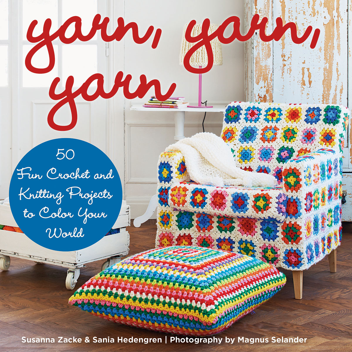
Yarn, Yarn, Yarn: 50 Fun Crochet and Knitting Projects to Color Your World by Susanna Zacke and Sania Hedengren (Nov 2014)
Follow interior decorators Susanne and Sania as they redesign their world with vivid colors and playful patterns.

Knitting Wizardry: 27 Spellbinding Projects by Amy Clarke Moore (Aug 2014)
An enchanted knitting collection that will take readers deep into the realm of wizards, witches, and magical creatures.

Sockupied: 20 Knit Projects to Satisfy Your Sock Obsession by Anne Merrow (Aug 2014)
A collection of 20 sock patterns for the first time in book form from the eMag Sockupied.

Recommendations for Teens:

Faux Taxidermy Knits: 15 Wild Animal Knitting Patterns by Louise Walker (Oct 2014)
Tap into the trend for taxidermy inspired craft projects in knitting form.

Knit Your Own Zombie by Fiona Goble (Dec 2012)
From your traditional living-dead moaners to the hard-partying Zombie Rock Star and deliciously evil Zombie Chef, each one of these creatures is easy to knit and hard to kill.

Huge & Huggable Mochimochi by Anna Hrachovec (Oct 2013)
20 large-scale knitting projects from a massive monster truck to a pirate pillow pal.

Knit Your Own Moustache by Vicky Eames (June 2013)
Become a punk, a Victorian gent, a gnome, or even a pirate - all it takes is one of these 20 knitted disguises.

Recommendations for Children:

Cool Knitting for Kids by Alex Kuskowski (Sept 2014)
Part of the Cool Fiber Art series, this book provides step-by-step, illustrated instructions for knitting projects including mitts, scarf, and bag.

The Mitten String by Jennifer Rosner and Kristina Swarner (Oct 2014)
Ruthie Tober's family is known for the beautiful, warm mittens they knit so when she and her mother meet a deaf woman and her baby and give them shelter,, Ruthie decides to design very special mittens for them.

Knit Your Bit: A World War I Story by Deborah Hopkinson (Feb 2013)
Mikey's dad has left home to fight overseas during World War I, and Mikey wants to do something BIG to help.

My First Knitting Book by Claire Montgomerie (July 2013)
Teaches children ages 7+ how to knit different stitches and patterns.

Friday, January 9, 2015

10 Facebook Tips Patrons Wish Their Libraries Knew

Every library knows it should be on social media. After all, that is where patrons are. But what they don't know could actually be hurting them. Thankfully, you have the 5 Minute Librarian here to tell you the ins and outs.

1. Post Often or Not At All

A Facebook page is not a Facebook Person Account. Your followers are not going to see all of your posts. If you're not posting often, they're very likely not seeing many of them. All of that work, for nothing... Might as well just close your account.

2. But Not Too Often

Of course, if you post too often, people will stop following you. One rule of thumb that I keep hearing about for libraries is to post twice a day. A serious library post in the morning and a fun post in the evening. In a future blog post, we’ll talk about scheduling posts, the pros and cons and 3rd party applications that can make your life easier.

3. Don't Be So Self Focused

Everyone in social media will tell you that you blog 1/3 of the time on your content and 2/3s you share outside content. This is actually a good thing. If you are posting twice a day, you will have to post about more than your library. Thankfully for you, there is much at your disposal. You can repost from local businesses, newspapers, schools, communities, and your city/town. You can share information about books and movies based on books. You can connect to current events with your collection... Stay tuned for a future blog post about how to easily find things to share and boost your post numbers.

4. Pictures are Worth a Thousand Words

Always include a visual with your posts. Studies show that it greatly increases the amount of people who click on your content. As we mentioned in a previous post, you can go to Library Market and sign up for access to a Dropbox Folder of Library content you can publish. And you can easily create your own using Canva.

5.  You Live and Die by Clicks and Likes!

Do what you have to do to get interactions from your followers. The bottom line is - the more people who interact with your post, the more Facebook will share it onto other people's feeds. This is a good thing! Even click bait is a worthy technique (i.e. click here to learn...), if your patrons like to click on the links and they're being redirected to worthy content. NOTE: We just started a new Facebook Group called The Shareable Clique for libraries to share their successful posts. Join the group to find new content to reshare on your own library page and to post about your triumphs!

6. Don't Kiss and Tell

You don't need to post EVERYTHING on Facebook. Yes, your library may offer a lot of programs, but you can skip the ones which aren't of high interest. Remember - if you post things that people aren't interacting with, it hurts your future reach.

7. Pay Attention to Your Facebook Insights

So, what are people interacting with? Well, Facebook has an insight page that shares exactly this information. Check it out frequently. Try new things and see what resonates with your followers. Then imitate. If you need a list of ideas of things you can try, check out Boom Social's 17 Killer Facebook Posts for Small Businesses.

8. Seriously, You Have Time for Facebook Insights

I cannot stress enough how important it is to pay attention to what your readers are responding to. Here is a gold mine of what they like, what information they want, and what time they're able to read it -- why not tap into it and get the most bang for your efforts? The more readers who see your content, the more they'll know about your library and the more they'll care about you, too. We're working on a future blog post that will talk about different ways people have succeeded on Facebook that you can try out.

9. Tell Followers They Can Be Notified of ALL Your Posts

If your patrons do not want to miss a post from the library, tell them that they can sign up for notifications for every post. They just need to go to your page and click on the arrow on the "Liked" box and then check off notifications. Advertise this fact often!

10. Try a Facebook Ad 

It is actually very successful for some libraries. It isn't that expensive and it actually reaches your nonusers in a way that no other library advertising can -- right in their homes.

BONUS Tip: Be Kind To Other Libraries

One thing that many librarians do is follow other libraries. If you're doing this, please interact with their pages. Just lurking will actually hurt their outreach numbers.

Interested in Facebook? Check out our other blog posts!

8 Free Ways to Boost Your Library's Facebook Reach

15 Viral Content Ideas for Your Library's FB Page! (Part 1)

Friday, January 2, 2015

9 Ways to Place Library eBooks into the Hands of Readers

How do you advertise your eBook collection? Check out the ways other libraries are doing it!:

OverDrive wrote a great post about Sacramento Public Library's eBook advertisements. They created stickers for their books, announcing it is also available in eBook format.


They also made shelf talkers with QR Codes on the back to alert patrons. They even provided examples any library can copy and modify.


Overdrive also created their own sticker and shelf talker templates that you can modify to your library's URL.


ACRL's blog highlighted a different kind of eBook shelf marker from Florida International University. This one is laminated and has a call number on the other side, discouraging users from bringing the cards home with them. Might be a GREAT idea for summer reading books?


Or, instead of laminating a shelf marker, you can do what Brisbane Grammar Libraries did and order these plastic holders which are magnetic on top so they sit directly on the shelf:


Barbara Plum also shared a display she made for her school library, printing out pictures of eBook covers inside iPad frames. Very cool and easy to do!


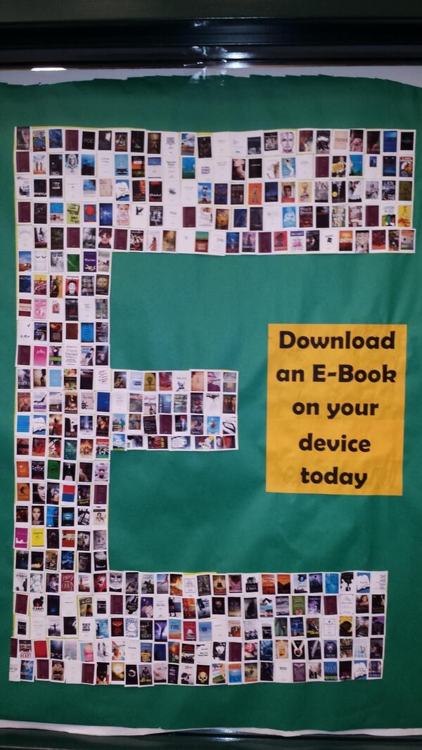
But if you only have a bulletin board, why not put together a display there? Love this one from Clear Falls Library:


And don't forget that you can advertise your eBooks outside of the library. Michael Stephens took this picture at the local airport where Traverse Area District Library advertise their eBooks. I would love to see more of these around trains and bus stations, too.


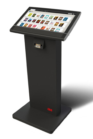
Oletangy Liberty Middle School actually has a kiosk right in their school library, encouraging students to check out the public library's collection of e-content: eBooks, music, audio books, and films. It is a touch screen and students only need a library card and the app to download up to 10 items at a time. This project cost them $1,850 since they already owned all of the content. (Not sure if they used the 3M kiosk pictured below, but I wanted to provide a visual.)


Happy eBook advertising in 5 minutes!